Layout Time
March 5, 2018
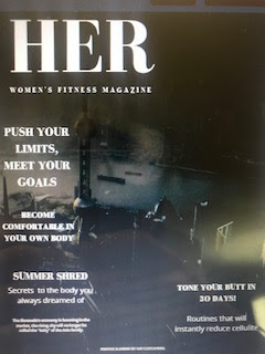
Hello guys, I'm back! In today's blog I'll be discussing the precise layout I want. So previously, our teacher assigned a project for us to conduct a magazine layout. I worked so hard and actually designed the layout to my potential. Because of this, I think I will end up using the design layout I created for my two page spread. It's a spread specifically made for a fitness magazine so it's perfect.
I thought maybe I could make each of the boxes on the right side a different color that all fall under the same color scheme so it resembles bright and colorful to the readers eye. I am deciding between using the colors red, orange, and yellow or purple, blue, and green or shades or blue or shades or purple with pink. I felt as if these color schemes work the best with each other and are very eye appealing.
What I will end up having to do is search up layouts with those color schemes to see if it's what I pictured and if it's what I will end up wanting to do for my project.
Personally, I don't like Taylor Swift which is probably why I don't like how the color scheme looks although mine will look much better!


Comments
Post a Comment